01
Symbol
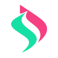
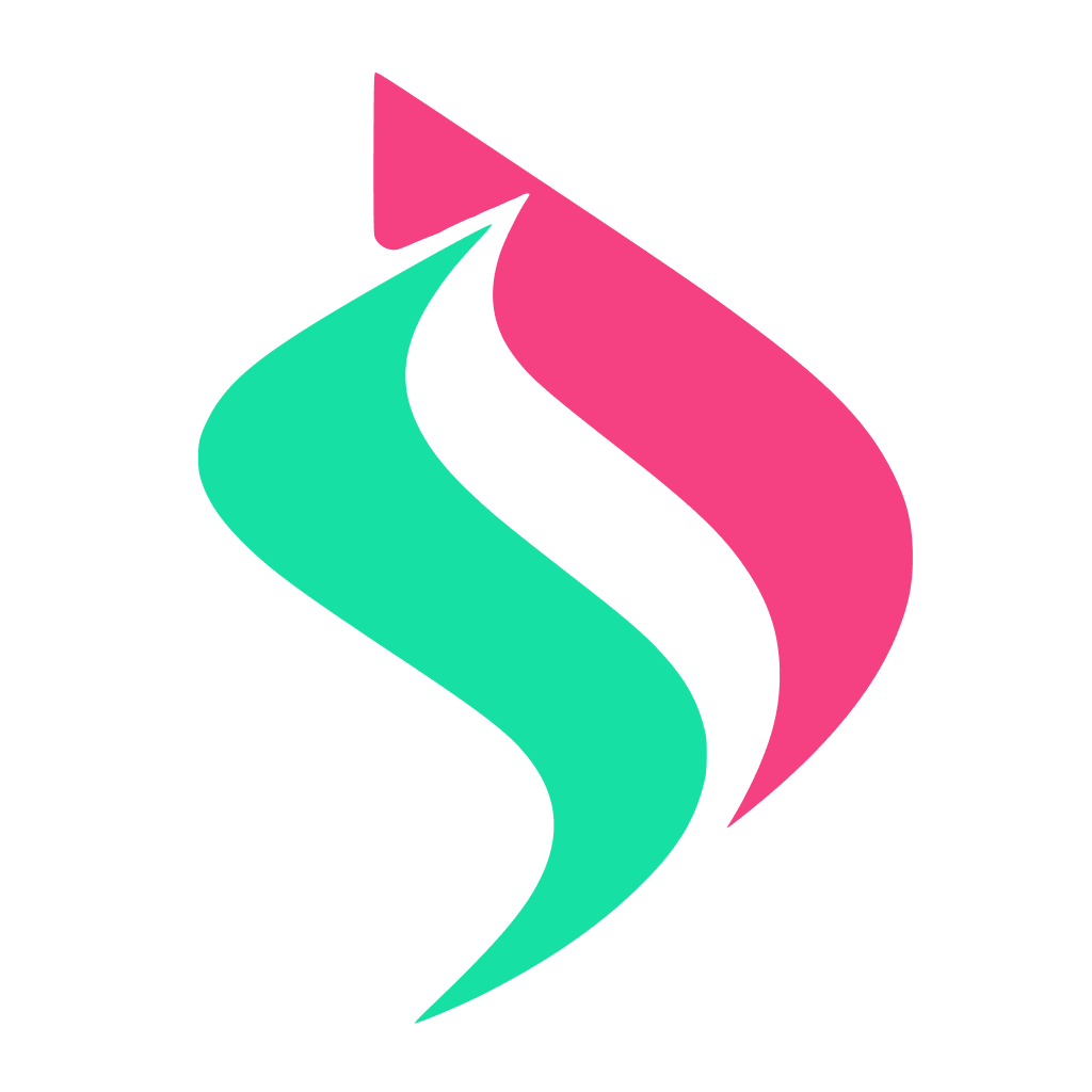
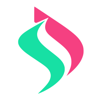
The symbol is built from two complementary readings: the green mass carries the “S”, while the pink mass resolves the “D”. Together, they create a more distinctive signature than a purely geometric or purely literal mark.
Serenity Dev Identity
This presentation defines Serenity Dev's visual core across four parts: symbol, logo, colors, and typography.
01
The symbol is built from two complementary readings: the green mass carries the “S”, while the pink mass resolves the “D”. Together, they create a more distinctive signature than a purely geometric or purely literal mark.
02
The primary lockup pairs the symbol with the wordmark in a format suitable for LinkedIn, simple landing pages, and digital materials.
Serenity Dev
Serenity Dev
03
The palette combines selective energy with a neutral base. Green and pink carry the brand signature. The neutrals support legibility and application.
Tropical Mint
#17E0A4
Wild Strawberry
#F54081
Jet Black
#1F2933
Cool Steel
#94A3B8
Parchment
#F3F1EE
04
Russo One gives the wordmark rigidity and presence. Manrope supports the rest of the identity with legibility, neutrality, and rhythm.
Brandmark
Serenity Dev
Support
Clarity, judgment, and reliable execution.
05
Ready-to-save PNG variants for quick use across profiles, decks, mockups, and other digital applications.
06
Large square PNG variants for cases where a centered mark works better than the smaller PNG export grid.